

(Credit: geralt/Pixabay)
Percentages can be deceptive and misleading
Do you remember learning about fractions at school? You had only just kind of mastered working with whole numbers, when they got broken up, and the intuitive rules simply didn’t work anymore. Why on earth was 1/3 + 1/4 not equal to 1/7? How could 1/2 of 1/3 be 1/6?
Even though in the meantime most of us are reasonably comfortable dealing with fractions – we might say that our System 2 understands how they work – our System 1 is still sometimes a bit quick in making guesses and getting it wrong. Somehow there remains something vaguely mysterious about fractions.
So thank goodness the ancient Romans came up with the idea of the percentage: everything with the same denominator, 100. How much easier this makes it to check whether 1/2+1/3+1/5 is more or less than 1… Just express it as 50% +33.3% +20%, and hey presto! But while summing percentages may be easier than adding fractions, we shouldn’t be too confident that we cannot be misled.
Retailers are pretty good at exploiting our cognitive limitations, and sometimes avoid using percentages, maybe precisely for that reason. Consider the popular sales promotion BOGOF – “buy one, get one free”. This is technically exactly the same as “50% discount if you buy two”, so we might think that it’s just a fancy way of packaging a half-price offer. But there is more at play: BOGOF promotions tend to be much more profitable than ordinary 50% discount offers, as Alex Tabarrok explains on the Marginal Revolution website. We’re tempted to buy more than we otherwise would (we have to purchase two items), and that temptation is boosted further by the use of the term ‘free’. And it can get more complicated: would you be able to work out quickly which one of these two deals, “Buy 2, get 3rd at half price” and “20% discount if you buy 3” is the best?
What is 100%?
Implicit in the term percentage is the idea that there is a whole somewhere that represents 100 – the percentages are really a comparison to this whole. As long as we know what this 100% is, we’re fine. But do we always know that?
Polls and surveys express outcomes as a percentage of respondents in a sample of a population, and we then extrapolate findings from that sample to the whole population. There is a whole science behind sampling (and, some might argue, even a bit of black art to compensate for biases) so that the result is accurate. That doesn’t stop for example advertisers being sometimes a bit cavalier with the numbers, though.
Here is one example: Avon’s “Youth Maximizing Serum”, an anti-ageing treatment line, is marketed with the claim that “after two weeks of use, 93% of women noticed a dramatic improvement in the overall appearance of their skin”. The small print, however, clarifies that this percentage is “based on those who expressed an opinion in a consumer perception study”. We can only guess how many women actually did express an opinion, how many did not, and how representative that sample is for all women. But that might spoil the fun of the headline 93% figure…

It’s easy to blame advertisers, but actually we don’t need them to hoodwink us: we are perfectly capable of deluding ourselves. There are several related cognitive biases that describe how we end up with a less than accurate view of the world. One of them is what Daniel Kahneman has termed WYSIATI (what you see is all there is) – we implicitly assume that what we observe is the “100%”, and we evaluate everything against that, ignoring the stuff we don’t see. Another one is the majority illusion: the local impression that a specific attribute is common, when the global truth is entirely different. We see a particular trait among the people in our network – say, friends and colleagues – and make this into our “100%” to determine how many people in general have an iPhone, vote for a particular party, or buy new cars rather than used ones.
Take your chance
Probabilities can be a particularly precarious area in which to play with percentages. Imagine there are only two, mutually exclusive possibilities, for example either it will rain tomorrow, or it will not. If the probability of rain is, say, 35%, then the chance that it will remain dry must be 65%. Our decision whether to have a garden party tomorrow should be the same whether we express the forecast as “35% chance of rain” or “65% chance of dry weather”. Yet that is not necessarily the case.
A study by Annette O’Connor at the University of Ottawa in 1989 found that the way probabilities are framed influences our choices in a rather more significant context. Cancer patients and healthy volunteers (in the hypothetical situation they would have cancer) were asked whether they would opt for, or against chemotherapy with a highly toxic drug, given a particular survival rate. One group of participants was given positively framed probabilities (e.g. 80% chance of surviving), a second group was given a negative frame (e.g. 20% chance of dying), and a third group was given both perspectives together. At high survival rates there was little difference between the frames. But below a 50% chance of survival, the negative frame led to a considerably reduced preference compared to the positive or the mixed frame, both for patients and for healthy volunteers. For instance, volunteers presented with a likelihood of surviving of 50% had a noticeably higher preference for the chemotherapy than volunteers given a likelihood of dying of 50% – despite the fact that they are technically identical.
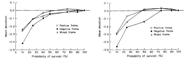
Patients to the left of me, volunteers to the right
(source: Effects of framing and level of probability on patients’ preferences for cancer chemotherapy)
The anchor of 50%
When we look at the world using percentages, “50%” becomes a powerful anchor. One reason is that we are often confronted with a choice between just two options, and there a majority of 50%+1 leads to a binary, black-and-white outcome. We see this all over the place, both in our personal environment (a group of friends voting for whether they’ll go for a curry or a pizza) and at large (a referendum to establish whether a country should remain in the EU or leave). More than 50% means certainty, whether it’s 50.1% or 85%.
This can distort our perception of estimated probabilities. If the weather forecast predicts 70% chance of rain overnight, and on that basis you decide not to water the garden this evening, you may well be annoyed if come tomorrow morning it has not actually rained – even though that was by no means certain.
An even more illustrative example was the EU-referendum, where both the prediction markets and the Superforecasters estimated the probability that Remain would win at around 75% on the day of the vote.
https://twitter.com/GJ_Analytics/status/745938783296696320
This contributed to a widely held expectation on both sides that Leave would almost certainly win – even Nigel Farage, the leader of the Leave.EU campaign group, all but conceded defeat as the polls closed .
There was widespread criticism afterwards: the superforecasters clearly “got it wrong”. But as they wrote a few days after the event, “A 24% forecast does not mean that there is a 0% chance that the event will occur, a distinction that all too often gets lost when forecasts are communicated in public.” Indeed, if I estimate there is 67% chance that rolling a dice will produce 4 or fewer dots, and the outcome happens to be 5 or 6, my forecast is not wrong.
Yet those percentages look so much like the percentage of the vote that it’s hard not to be (at least a little bit) deceived by it. An FT article by John Kay, and in particular the comments below it show how easily they are confused and misunderstood.
As the US presidential elections have entered the final straight, it’s worth bearing in mind the distinction between those two types of percentages. On 12 July, 538 estimated the chance that Hillary Clinton would win the election at 77.4%, with 22.5% for Donald Trump. That looked like a very comfortable majority, but it was of course nothing of the kind. The likelihood of Trump winning was only a little less than that of tossing two heads in a row – as someone on Twitter remarked: “President Trump is just two coin flips away”. Since then the odds have shortened considerably, and we’re talking about just one coin flip now. And for anyone who had rather not see Trump in that role, that is a frightening prospect.
Maybe the “over 50%” illusion provides us with a sense of certainty. But that sense is false, in the same way that the What You See Is All There Is bias gives us a distorted picture of reality. When we think in percentages, we have to have a good idea of what ‘all’ – “100%” – is.
Otherwise we will be fooled by a %-sign.

Pingback: More fun with percentages | Koenfucius